Saturday, October 4, 2014

International Recognition of Collaboration with German Design Students

I found an German article about my international collaboration with Prof. Marcus Haberkorn at the Uni Trier, Fachbereich Gestaltung!

Title: "Over the Atlantic: Intermedia Design Students Collaborate with the USA."

Über den Atlantik: ID-Studierende kooperieren mit den USA

Friday, March 7, 2014

Johnson & Wales University - Engineering and Design - Job Fair January 2014


This year's Johnson & Wales University School of Engineering and Design Career Fair had a great turn-out despite freezing winter weather and mid-terms stress. JWU Career Services had organized, once again, an excellent opportunity for our JWU design students to meet potential internship or full-time employers. The companies had set up booths and were eager to talk to interested students. Many Senior students came all dressed-up, resume and business card in hand, ready to rock.

Saturday, December 7, 2013

International Design Collaboration in My Classroom!


Students at Johnson & Wales University in Providence, Rhode Island (in my DME3110 class) look at the video feed from Prof. Marcus Haberkorn's design students at the Fachhochschule Trier, Germany. We had a great time talking about Cultural Misconceptions. And the communication via Google+ Hangouts video-chat, Facebook and Skype provided inexpensive ways for the students to gain international team work experience.

Tuesday, November 26, 2013

Design's Role in Innovation


From the UK Design Council:
"The Design Council started life in 1944 as the Council of Industrial Design. Over more than 60 years Britain has seen massive social, economic and technological change. We've changed too, though we've always fought to make design central to Britain's well being."

Is There a Problem?

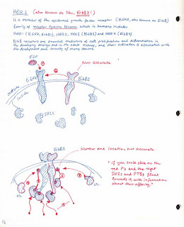
Sketches for an animation about cell signaling pathways.
Collecting information about the new project is the first step in a successful design process. Inquire about the project before the first interview.

Sort through photographs, text, sketches, print materials, as well as existing corporate identity, and web designs. The goal is to find the client’s design problem. And the client might not be aware of the fact that they have a design problem, and that having one is a good thing.

For example, a non-profit client who would like to provide resources for homeless people might hire a design studio to create a new website. At the start of the project, the design team collects information about the client, analyzes the way the client communicates with their target group and finds out about the type of information, which should be communicated.

While learning about the target group, the team finds that 80% of the city’s homeless population does not have regular online access. Due to this information, the team propose a flyer campaign instead of a website.

The design problem that needed to be solved in this fictive scenario was: “How do we effectively provide information for homeless people, who live without a permanent address or access to the Internet?”

Wednesday, September 21, 2011

Typography: Pay Attention to Details

"Pay attention to the details" is a sentence which can be heard in every digital media & design class. The whole composition of this photograph is beautifully distracting. Usually really quick in spotting typos, it took me a while to see this one on reddit. 

Wednesday, September 14, 2011

Camera Obscura


Camera obscura.
Woodcut, Father Athanasius Kirchner (1601-1680)
Illustration from “Ars magna lucis et umbrae
Rome, 1646.

Kircher's massive treatise, 'Ars Magnus Lucis et Umbrae', contains observations on the nature of light, lenses, mirrors, sundials, astrology and (Ptolemaic) astronomy and related topics. It also includes some of the earliest descriptions of the camera obscura and the magic lantern.

Camera obscura means 'darkened room'. A small hole in a wall allows a limited amount of strong, reflected light rays to be projected onto the opposite wall. The image will be seen upside down, moving and in color. Renaissance landscape artists used portable camera obscuras in order to create highly detailed, naturalistic drawings.

A very small pinhole creates a sharp image, but the light also becomes weaker, and the image appears darker.  Early models were large, comprising either of a whole darkened room or a tent (for astronomers). By the 18th century, more easily portable models became available, which are seen as the precursors to photo- and film camera.

Source: http://bibliodyssey.blogspot.com/2008/09/ars-magna-lucis-et-umbrae.html and Wikipedia.